Communicating the unique marriage of nature, human innovation & technology for a manufacturer of plant-based fiber solutions.
Developed a distinct and recognizable brand identity for a materials science organization focused on reducing plastic pollution.
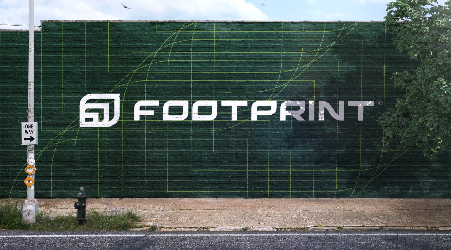
Crafted a brand message highlighting the fusion of nature and innovation, supported by a handcrafted wordmark and unique iconography.
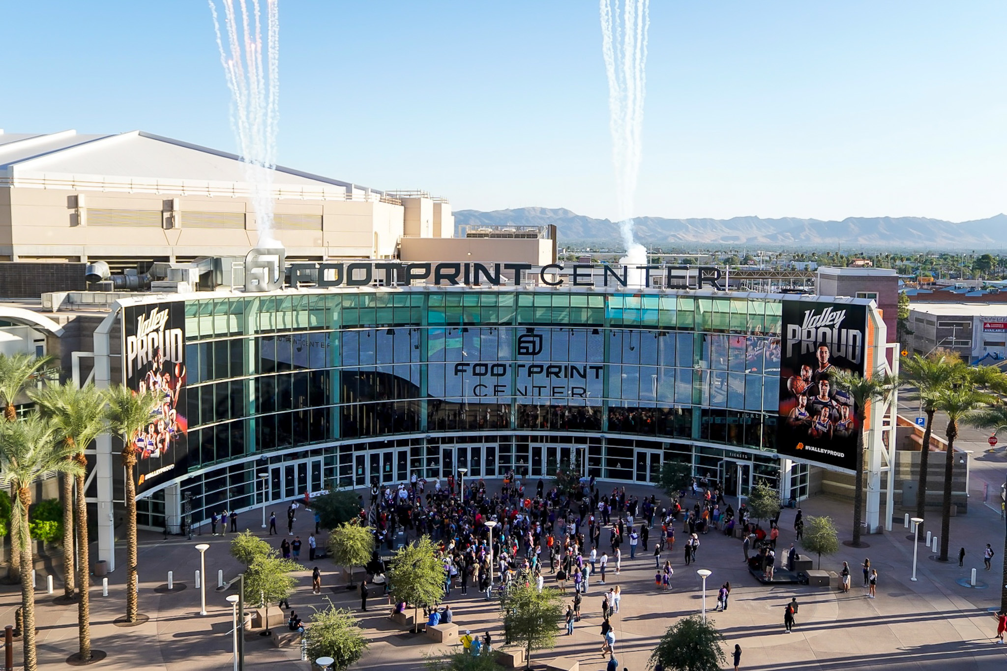
Successfully adapted branding to stadium scale, promoting innovative sustainability for a national sports and entertainment venue.
The Challenge
Footprint is a materials science organization that specializes in engineering fiber-based packaging as a solution to plastic pollution. As part of its efforts to increase brand visibility and strategic positioning, Footprint sought to refresh its brand identity. To accomplish this, Footprint partnered with L+R. Through this collaboration, Footprint was able to successfully rebrand itself to effectively reflect its mission-driven and science-led approach.
The Outcome
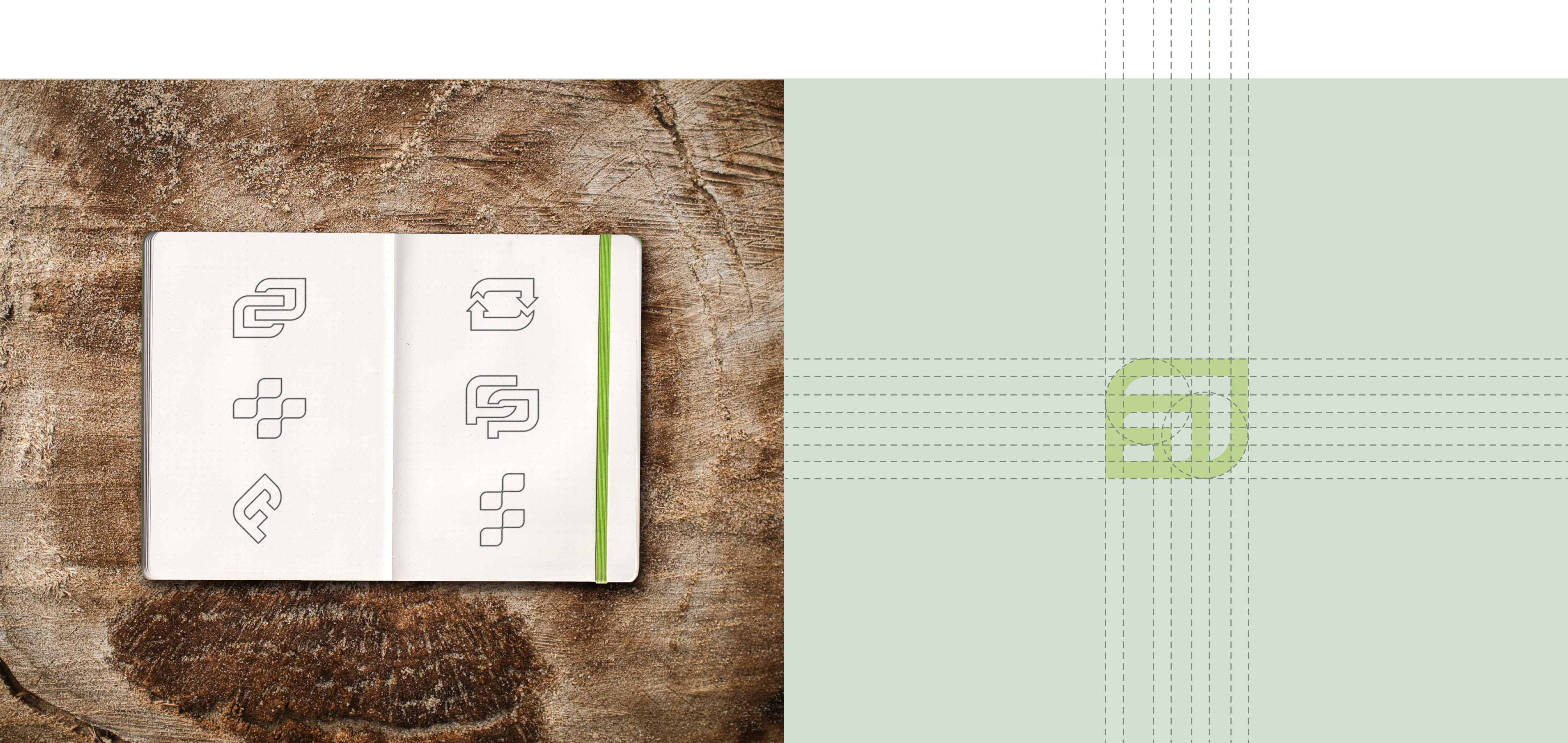
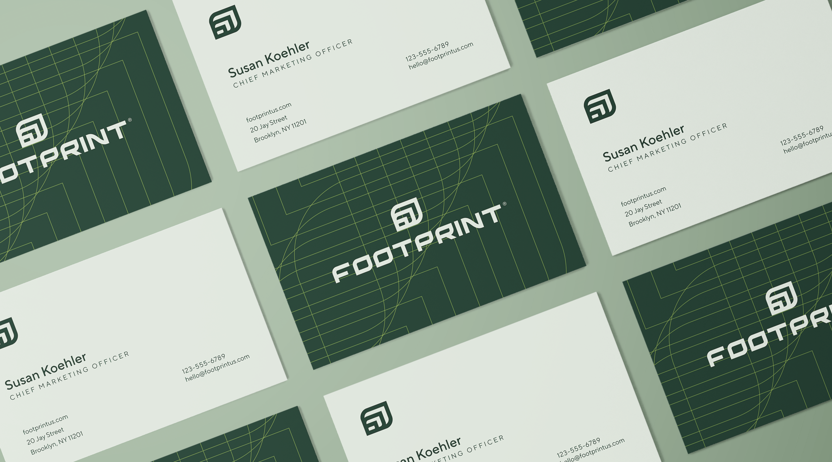
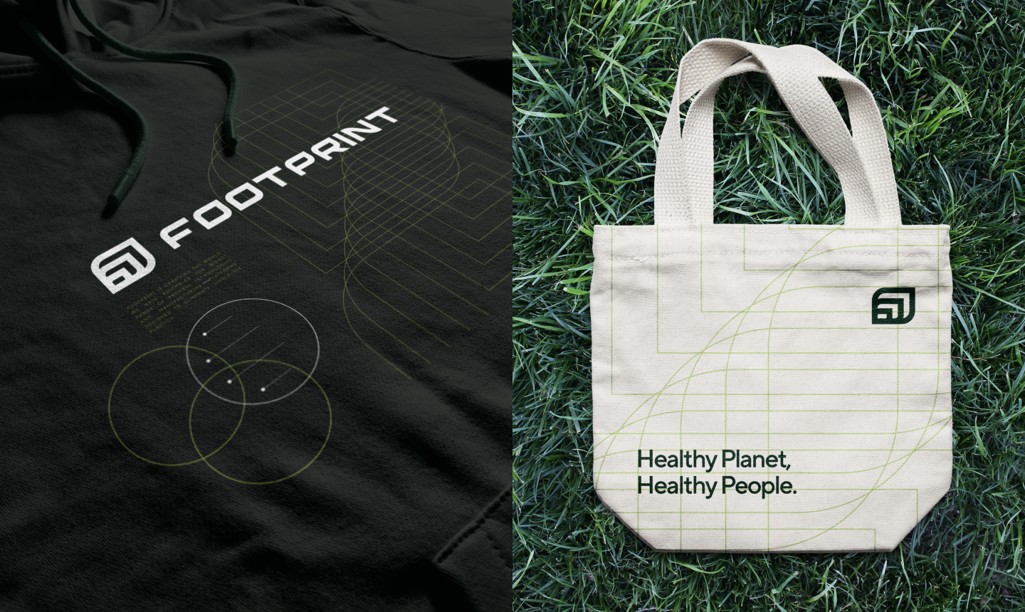
The Footprint icon and wordmark are a result of extensive research, design iterations, and focus group testing to create an instantly recognizable and distinct brand. This is especially important in the consumer packaged goods industry, where many products may be perceived as "greenwashed" and it is crucial for a brand to stand out from competitors. The Footprint icon and wordmark effectively convey the brand's message and identity.
Plastic Solution Statistics
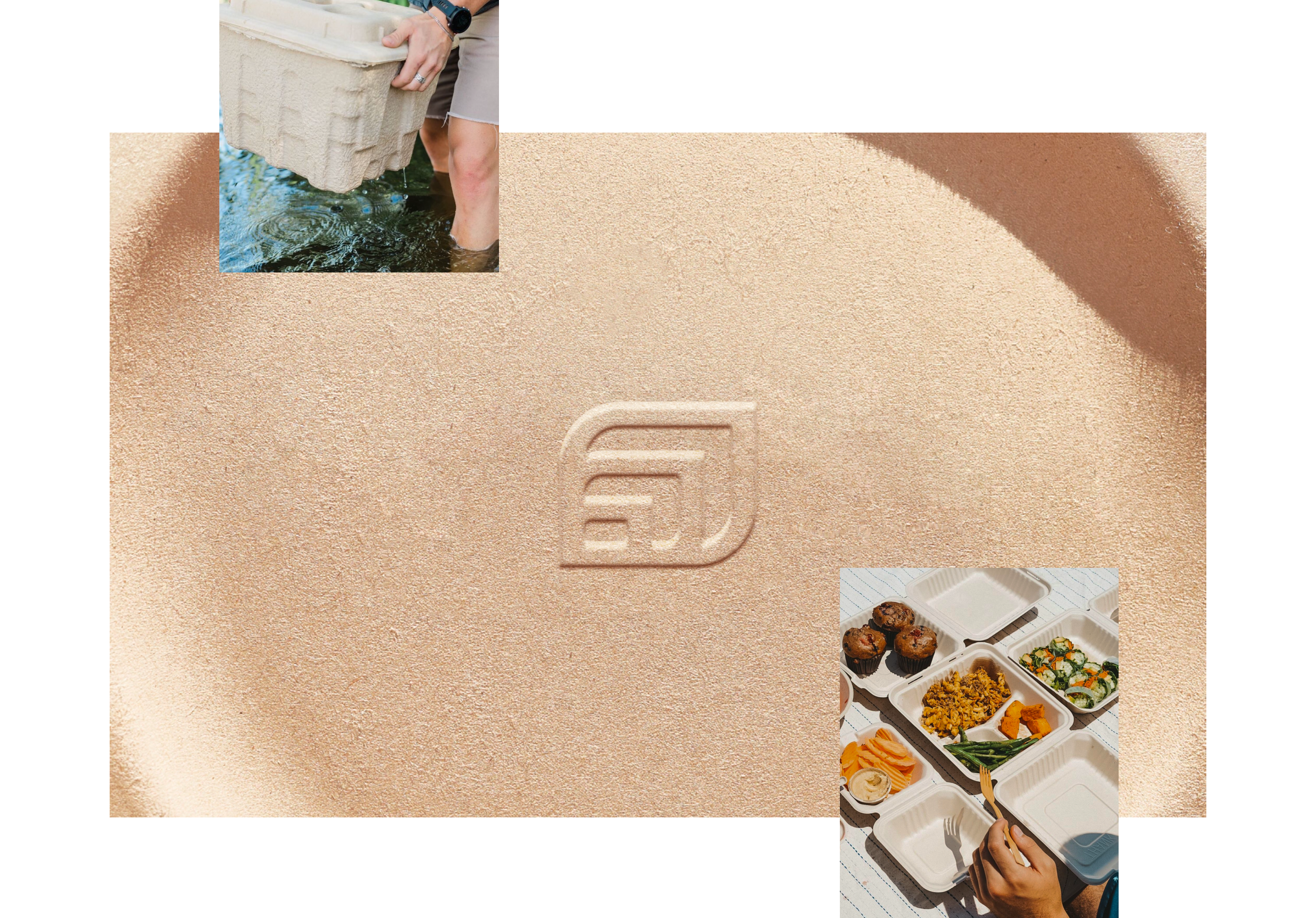
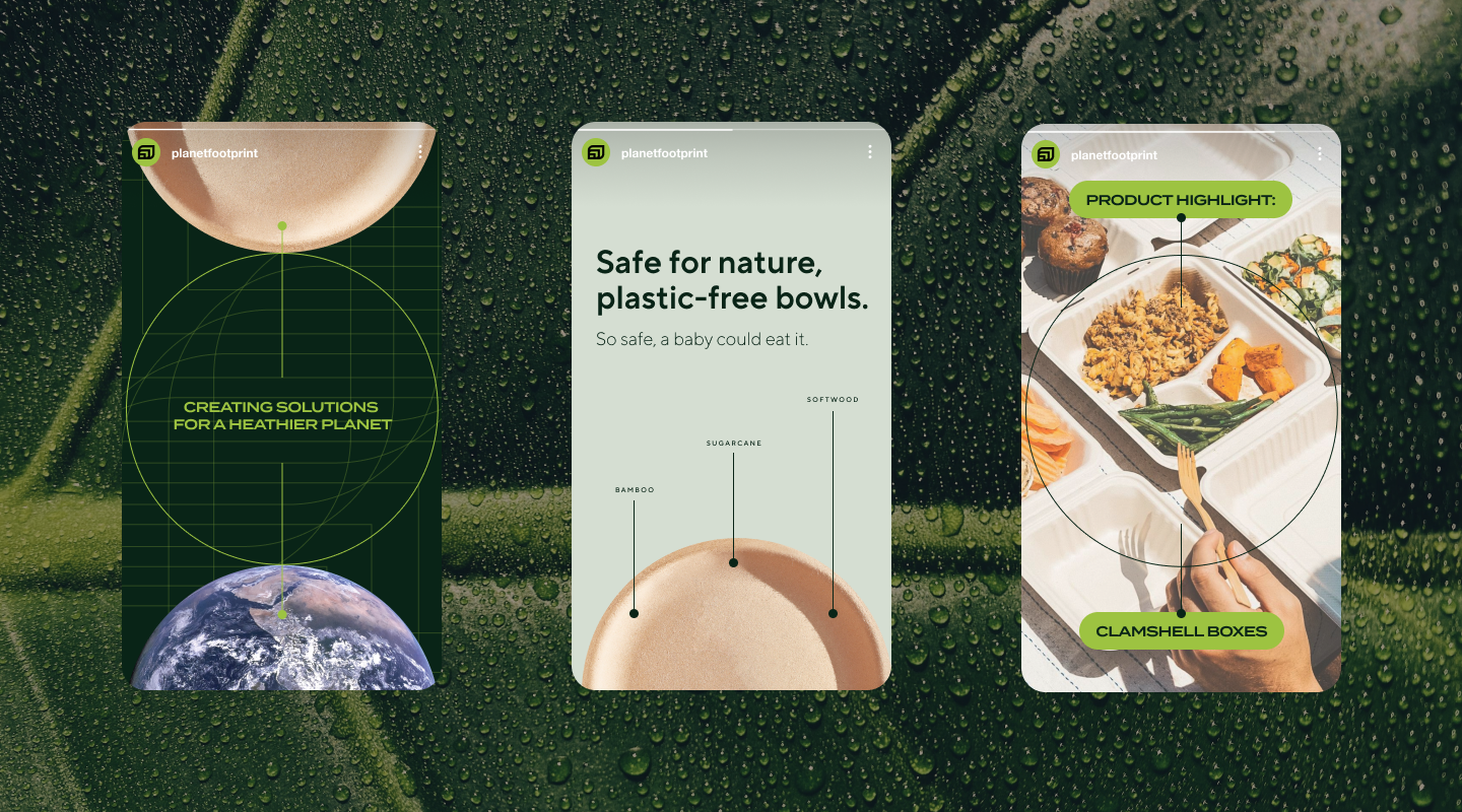
Annually, the global production of plastic exceeds 300 million tons, with approximately half of that being used for single-use items like food packaging. Footprint, founded by former tech engineers, aims to reduce this volume by offering recyclable and compostable plant-based products as alternatives to traditional plastic.
Creating An Iconic Brand with an Unmistakable Message
L+R created a new brand identity for Footprint that centers on the company's utilization of plant-based materials in its products. The redesigned iconography embodies Footprint's fusion of nature and innovation, as well as its B2B2C go-to-market strategy.
The handcrafted wordmark conveys Footprint's sophistication and power as a guardian of the planet. The concentric leaves of the icon symbolize the potential for Footprint's solutions to expand and scale without limit, as well as the lasting impact of our choices on future generations.
In many ways, innovation created the challenges we face. We wanted the iconography to send an unmistakable message that innovation will be the answer to overcoming these challenges.
”
Inspired by the Company’s Vision and Mission
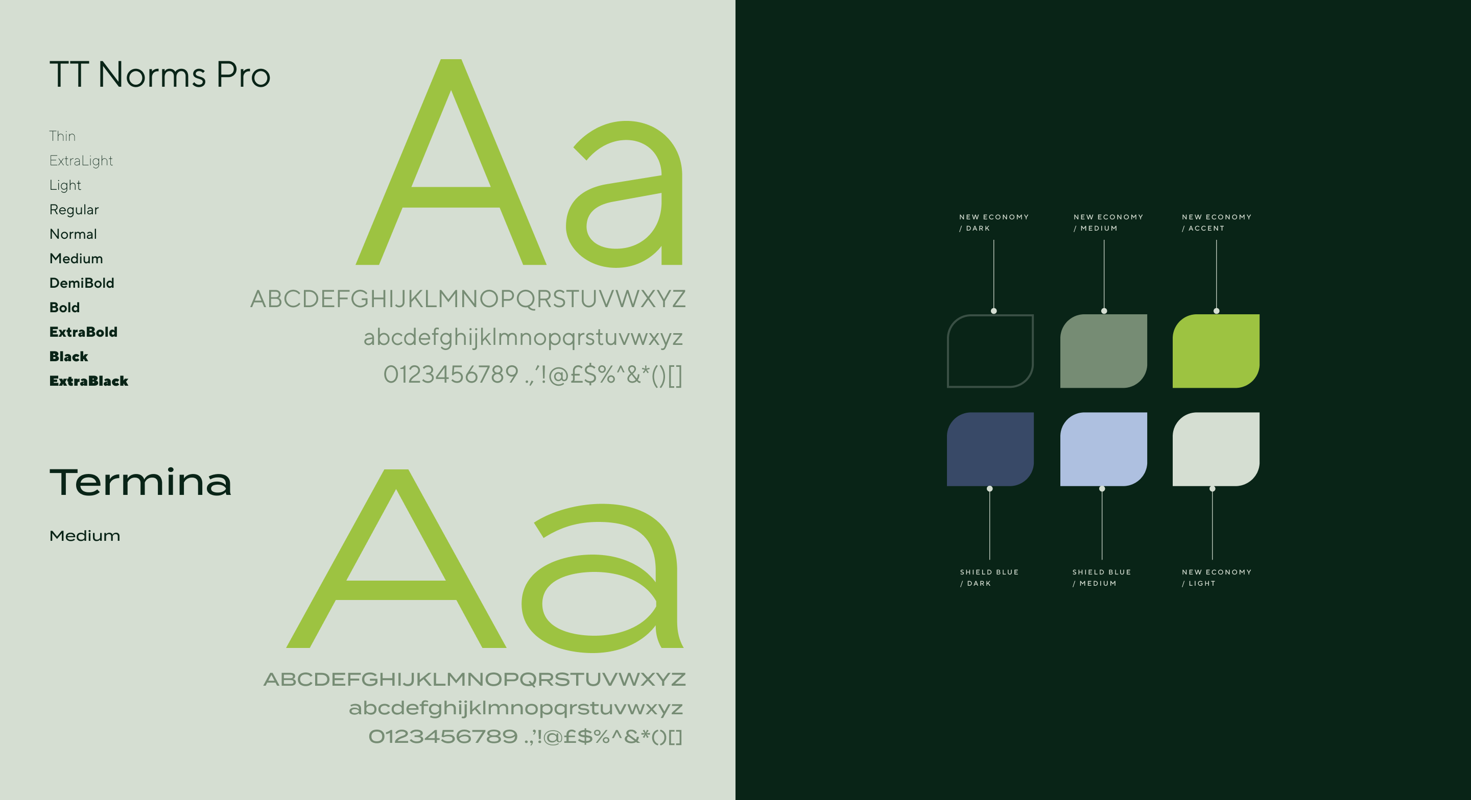
The brand's color palette is inspired by Footprint's approach to creating a healthy planet and healthier people through innovation. The colors, New Economy and its variations, are neutral greens that represent practical changes to existing systems. Shield Blue represents the brand as a science and technology company.
The primary and secondary typefaces are clean and modern and were chosen to complement the wordmark and icon without competing with them in various applications.
Brand Components
The angular design treatment reflects the company's focus on science and technology, and the interlocking pattern symbolizes the use of plant-based fiber technology in its products.
Stadium Scale
Footprint later acquired the naming rights to a national sports and entertainment venue that is home to the NBA’s Phoenix Suns and WNBA’s Phoenix Mercury, as well as the Arizona Rattlers of the Indoor Football League. Footprint approached L+R to adapt its branding to stadium scale in a manner that communicated the brand’s innovative approach to sustainability for the future of the stadium. Learn more about our work on the Footprint Center here.