Interactive digital education experience design for a non-profit dedicated to policy change for a more equitable economy.

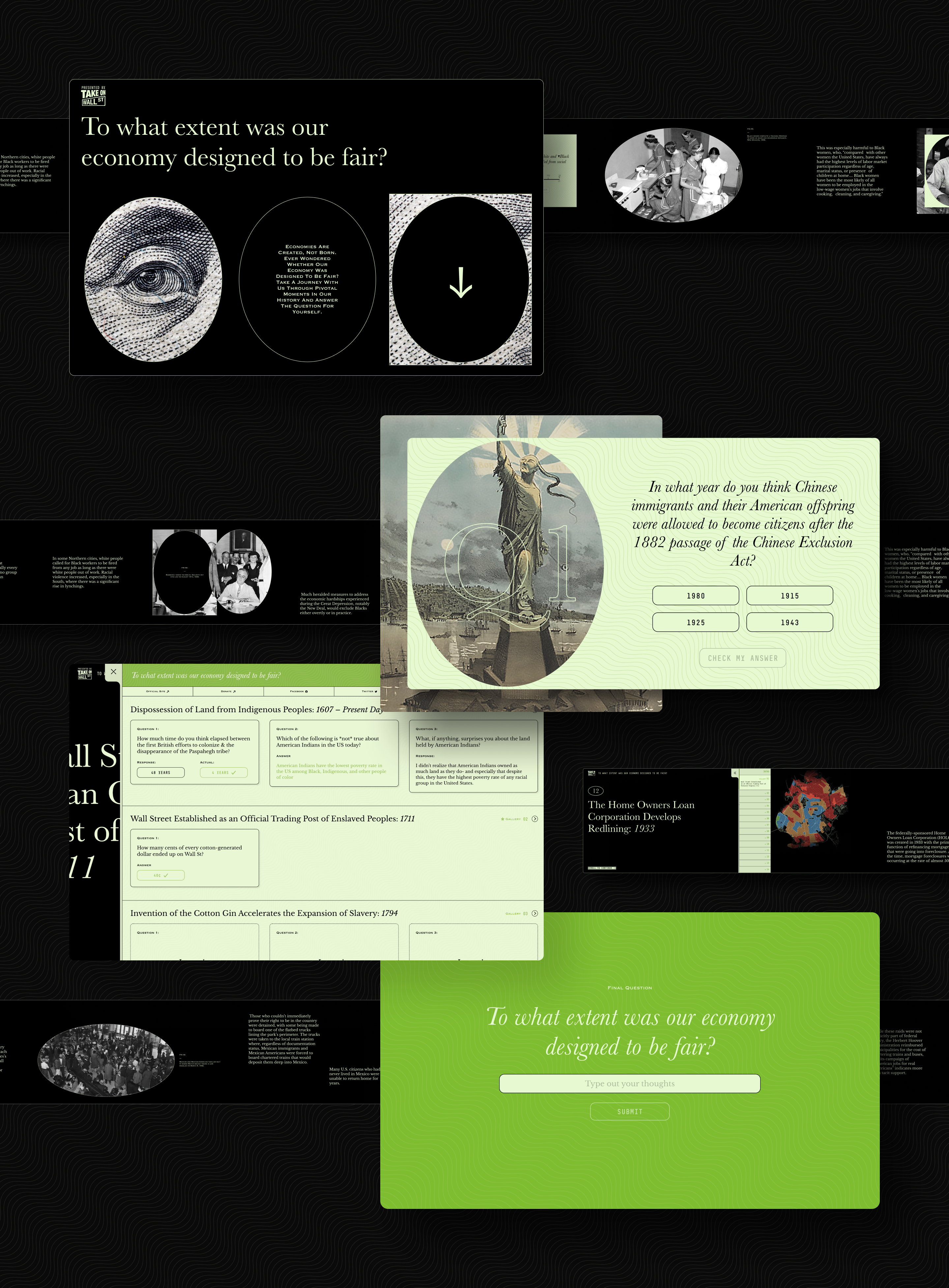
Utilizing horizontal scrolling effects and micro animations, the visually appealing design and user-friendly interface engage users and efficiently convey complex concepts.
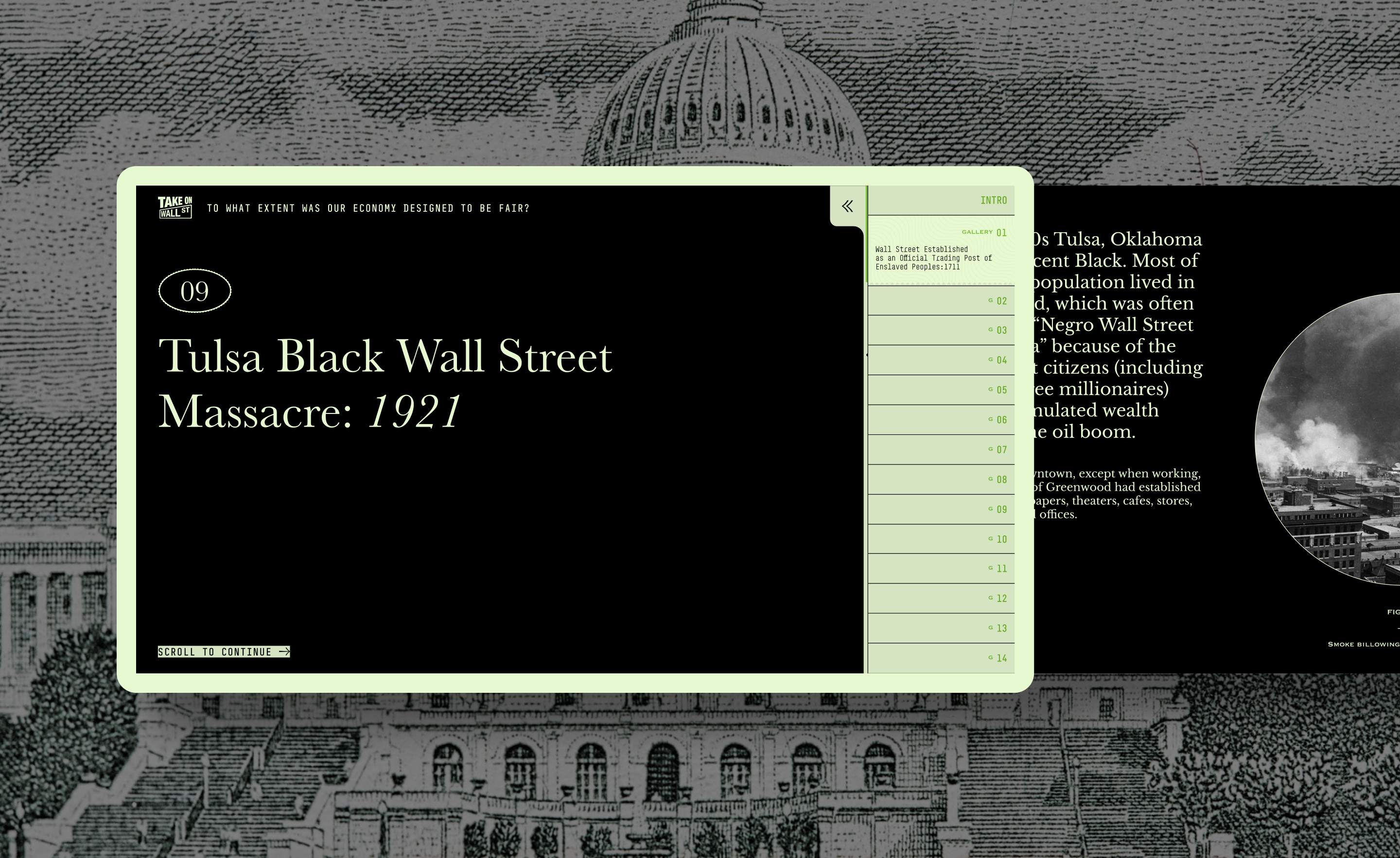
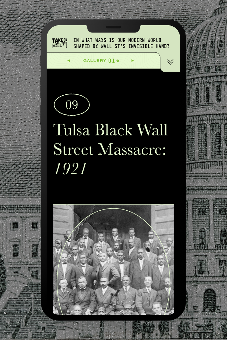
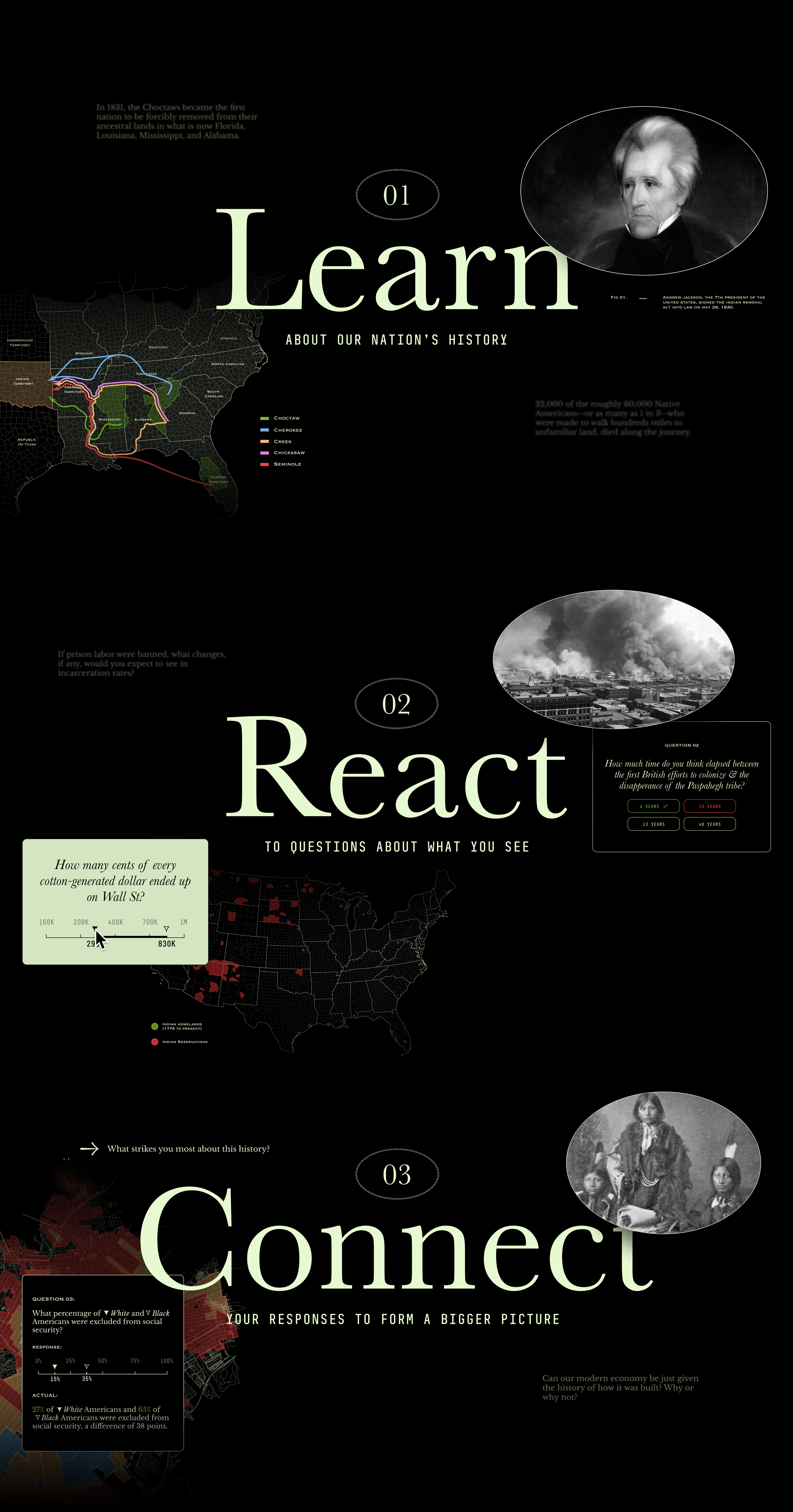
The site connects 14 significant events in American financial history with powerful imagery and illustrations, leveraging emotions to enhance memory retention and engagement.
The impactful design and storytelling of the educational website earned recognition, winning at the Anthem Awards and the Communication Arts Interactive Awards.
The Challenge
Take on Wall Street is committed to improving the fairness of the financial system in the United States. It is widely acknowledged that the current system is unjust, but many people do not fully understand the historical context that has contributed to this reality or what can be done to address it. In an effort to foster a comprehensive understanding of the root causes of economic inequality, Take on Wall Street partnered with L+R to create an interactive educational website for individuals and activists seeking to explore the history of the US economy.

The Solution
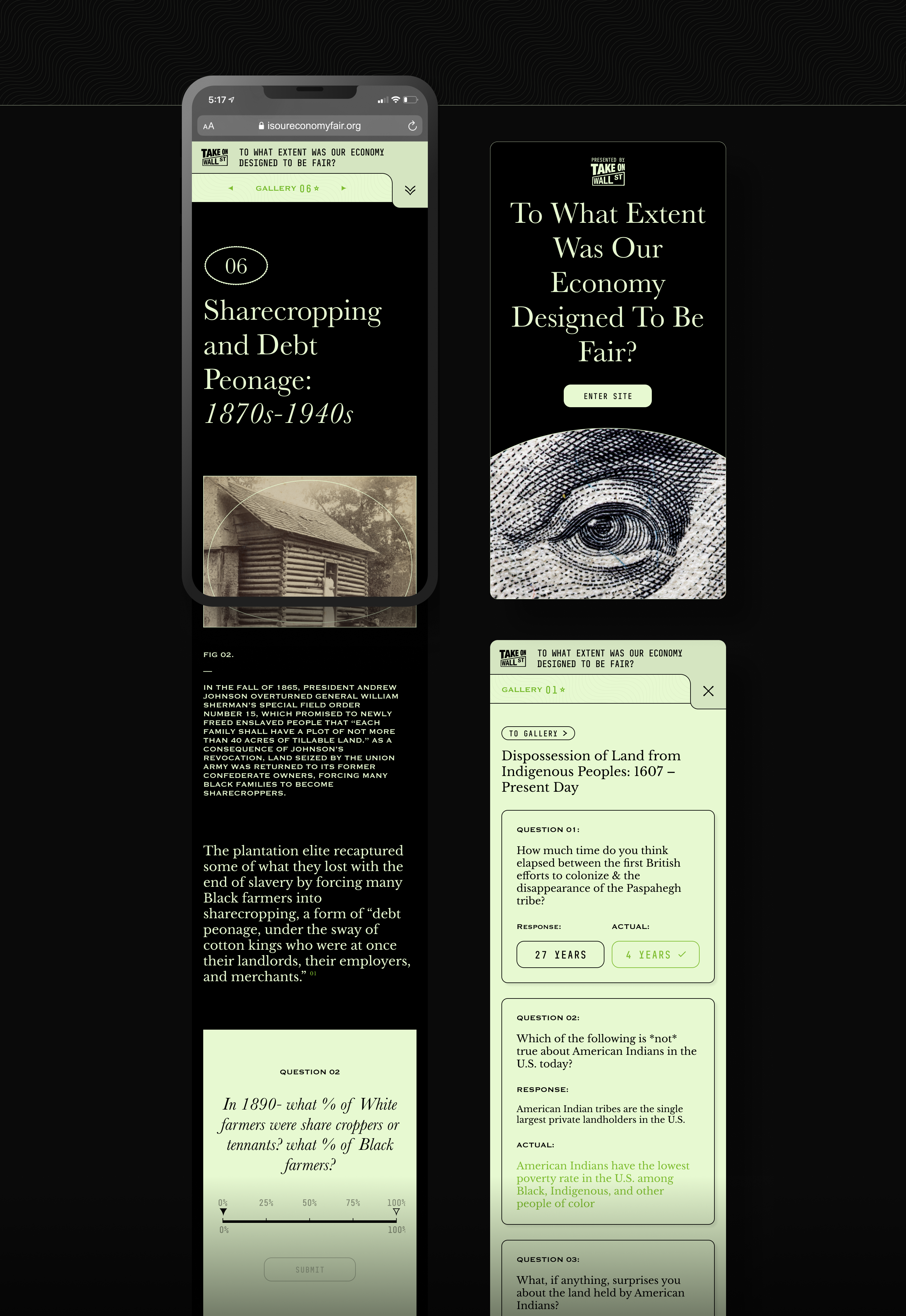
The website, isoureconomyfair.org, utilizes a visually appealing design and user-friendly interface to educate and empower visitors on the ways in which financial institutions have historically wielded their power to oppose movements for racial, climate, gender, and economic justice and prioritize the interests of Wall Street over those of the working class. From colonization to the present day, the website effectively illustrates the impact of these institutions on individuals and society as a whole.
Powerful Interactive Storytelling
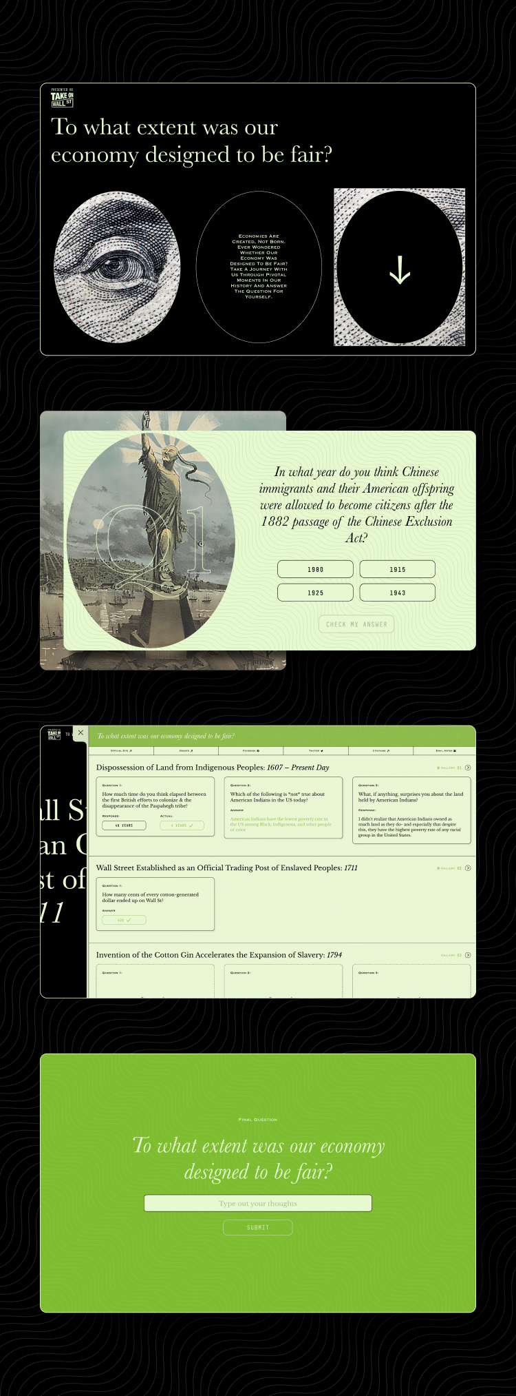
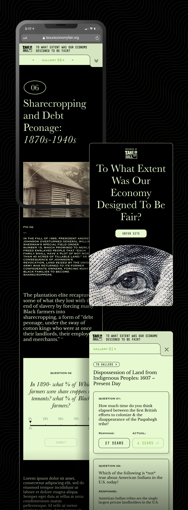
The website examines the enduring influence of 14 significant events on the financial system in American history. A major challenge in the creation of the website was to design a user experience that would maintain visitor engagement. To achieve this, horizontal scrolling effects were implemented to provide a visual timeline that guides users through the content. Additionally, micro animations were utilized to efficiently convey complex concepts, such as the dispossession of land from Native Americans, while minimizing the use of text.
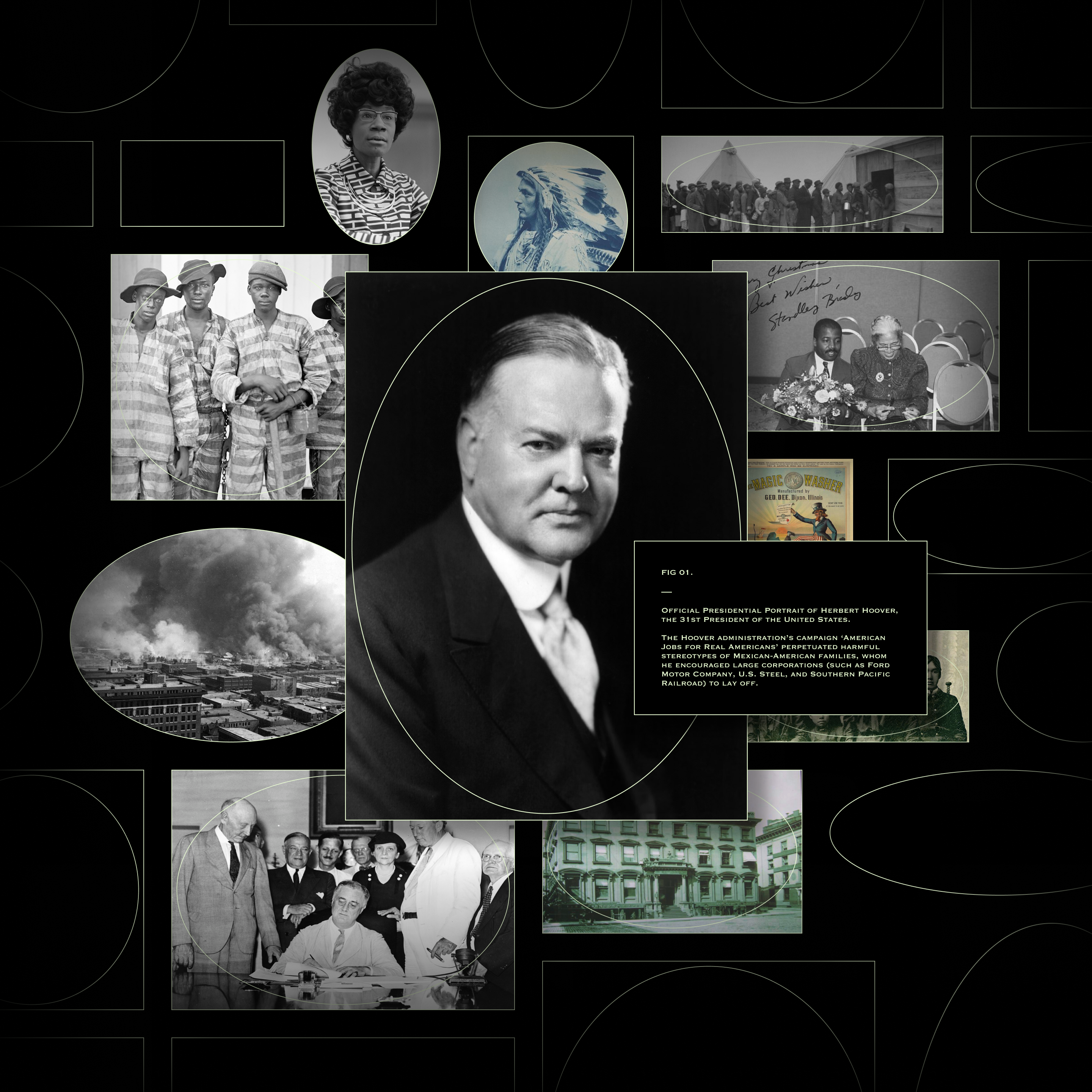
Connecting History to its Context
The experience utilizes periodic multiple-choice questions and open-ended prompts to engage visitors and facilitate their connection to the material. The "notebook" feature allows users to review and revisit their responses, encouraging a deeper understanding of the historical context.
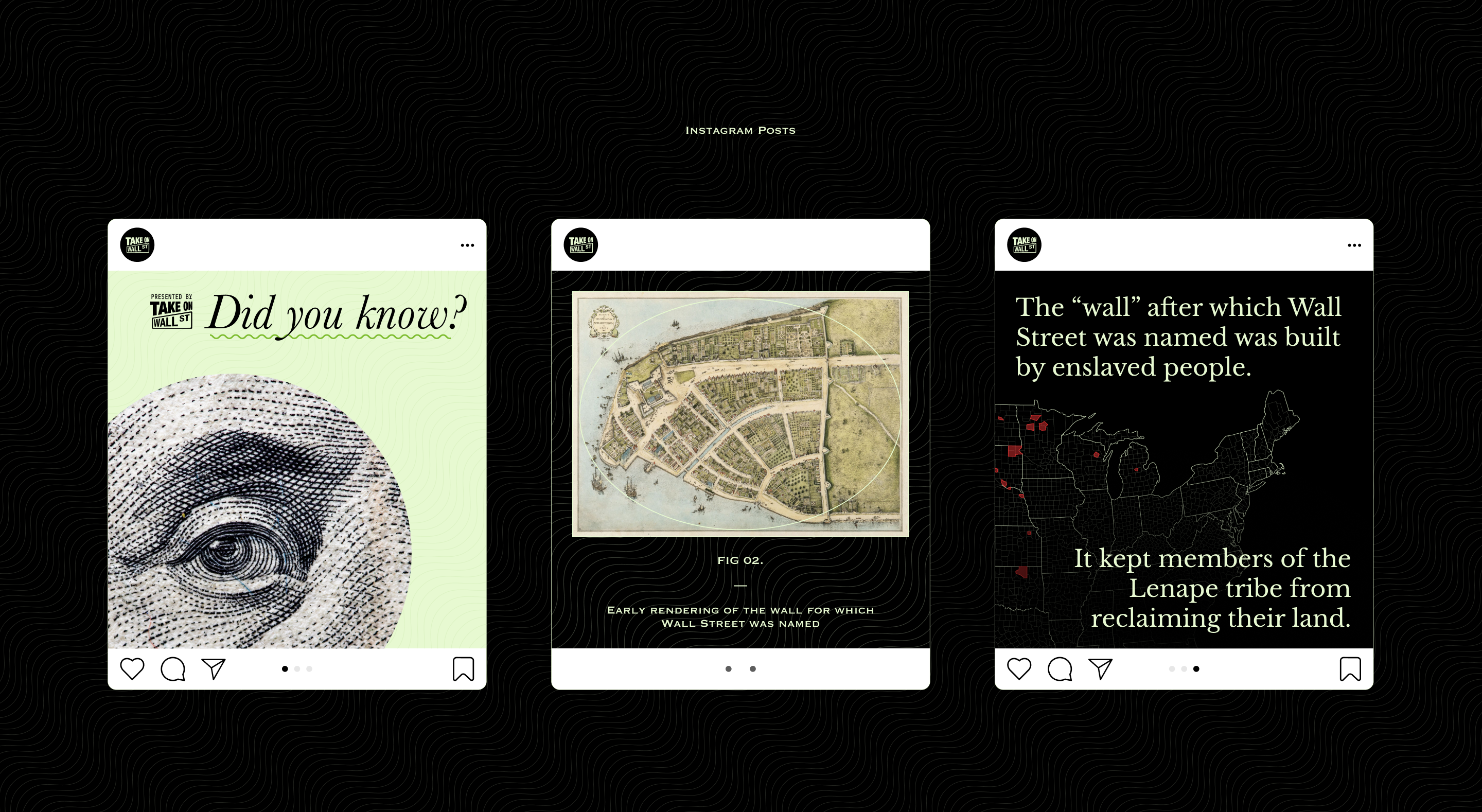
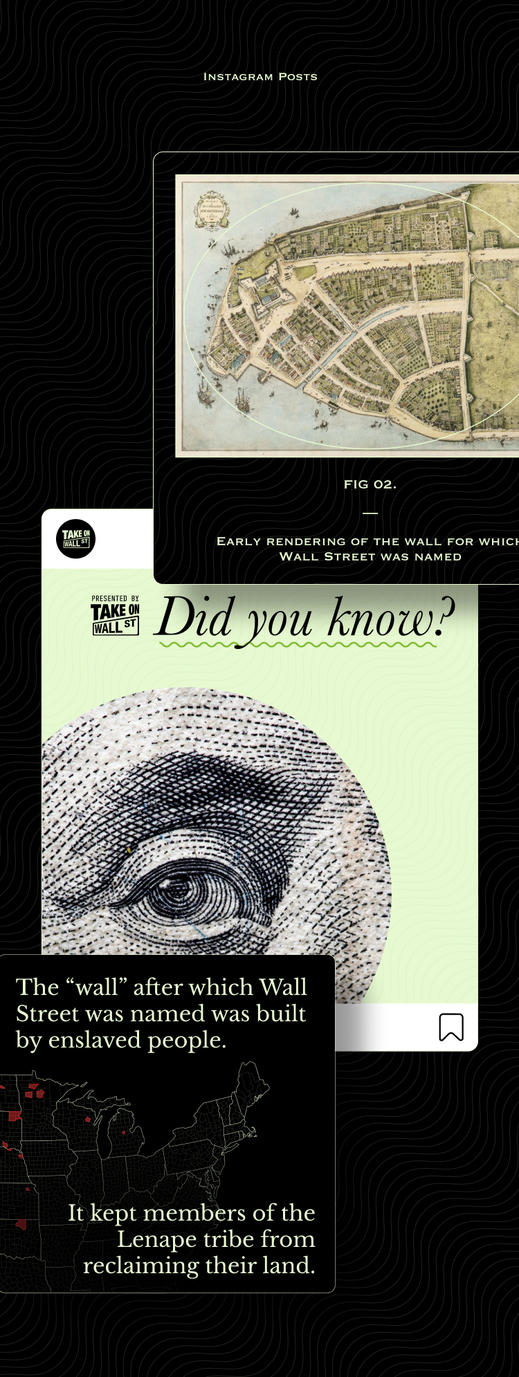
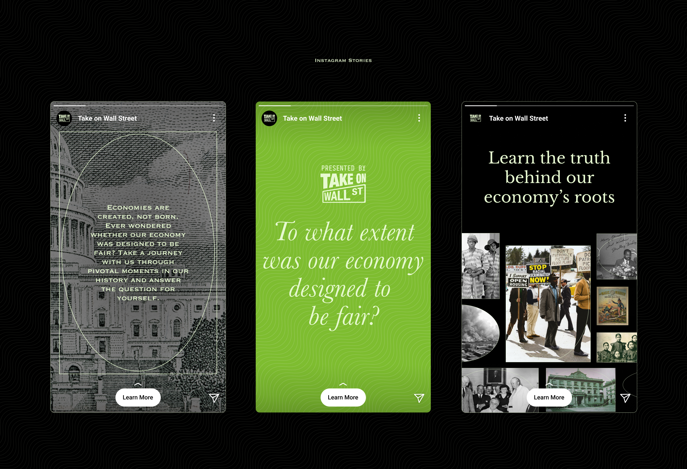
Complexity is too often a barrier to change. The powerful imagery, illustrations, and interactions on this site cut through complexity and connect individuals to the information.
”
Minting Meaning
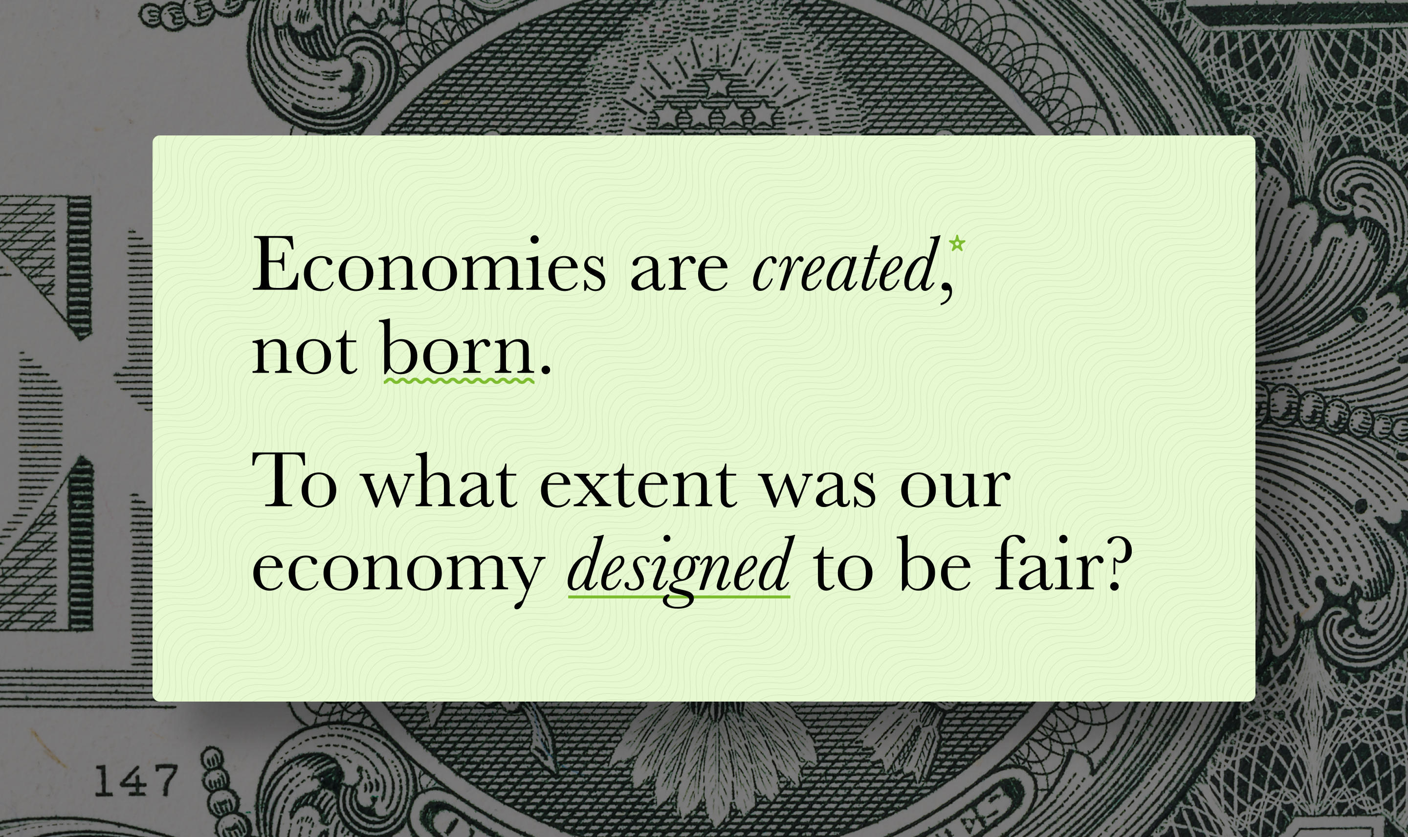
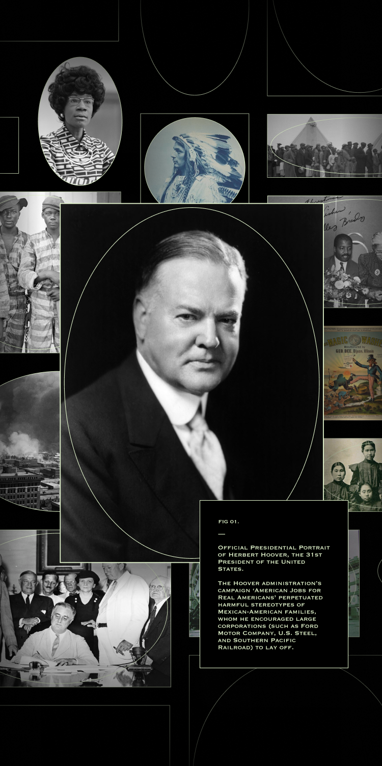
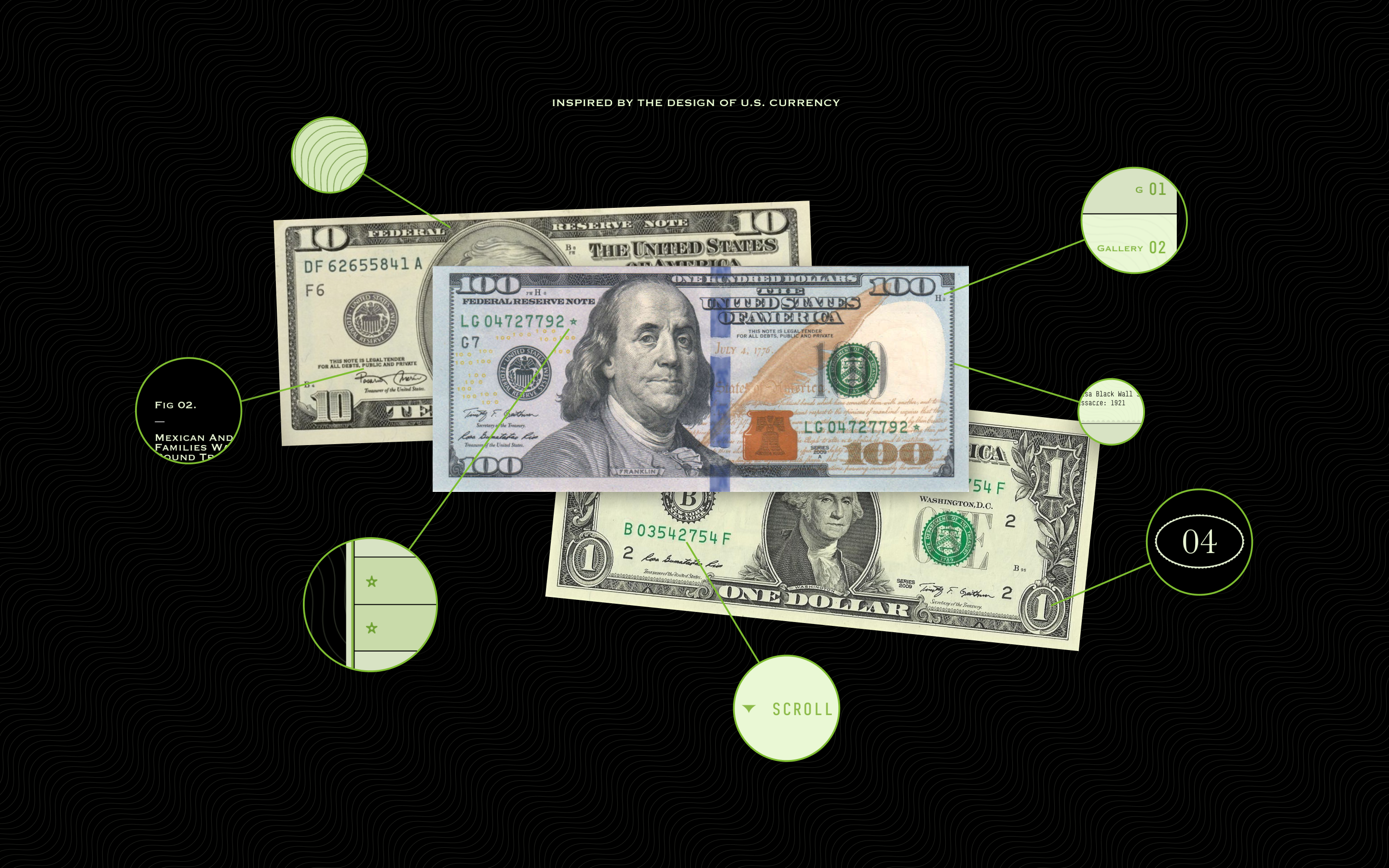
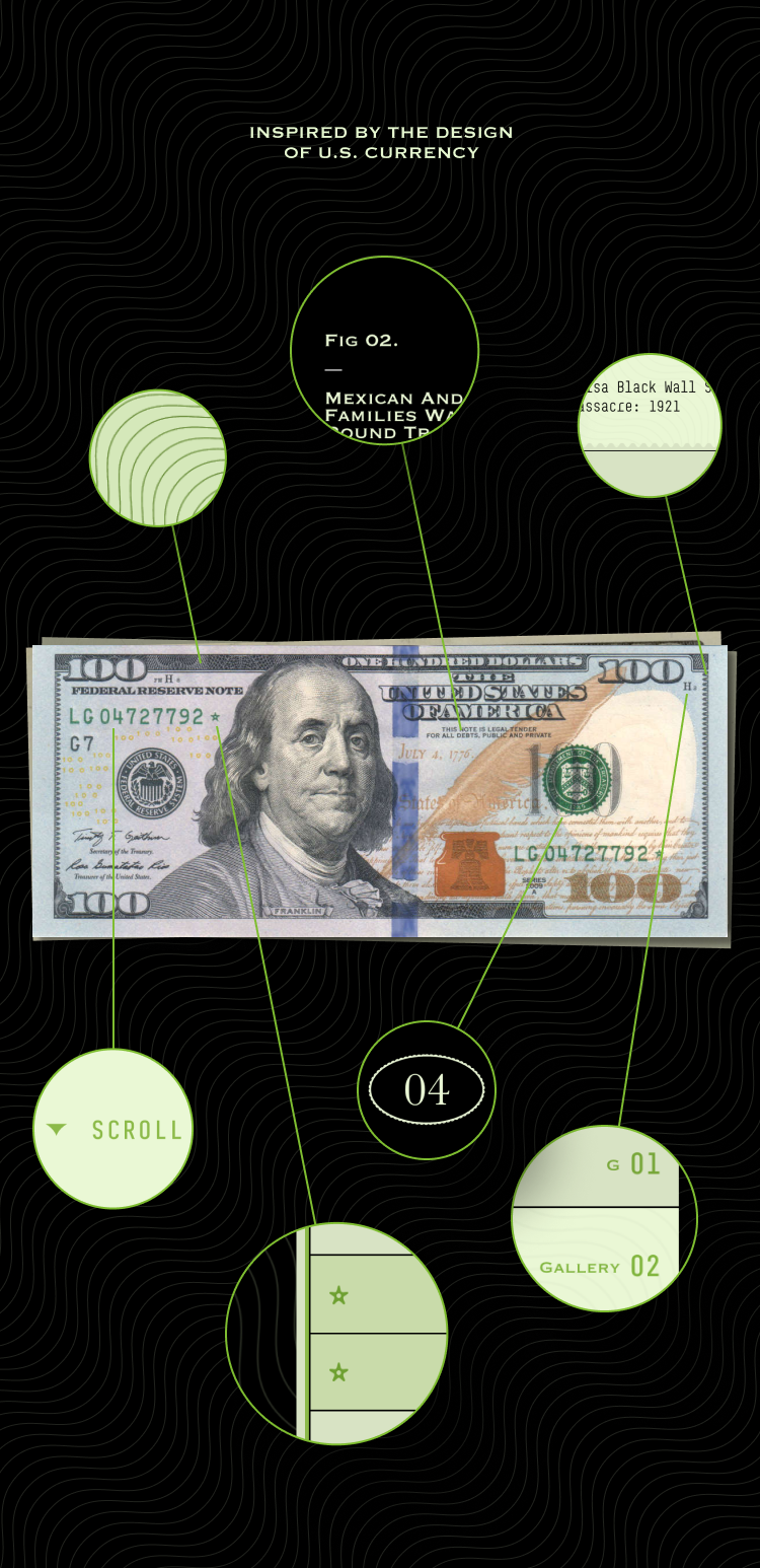
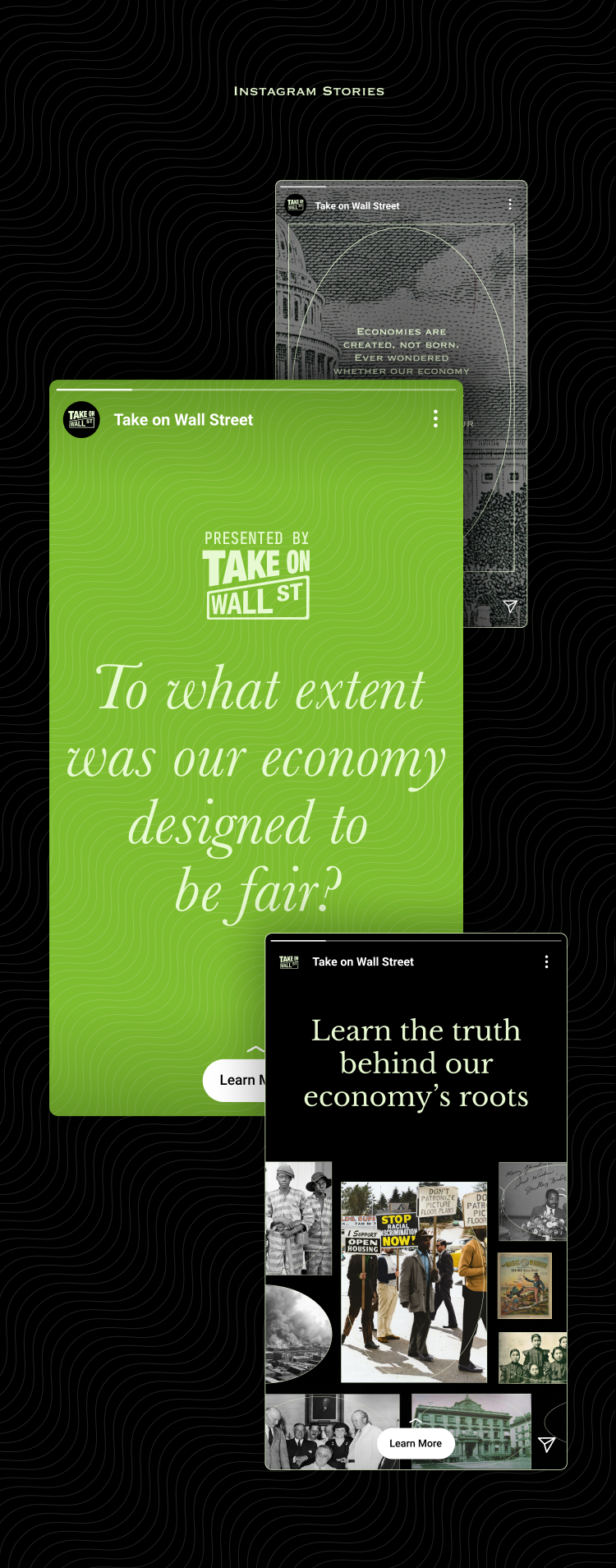
The design of the site was influenced by the aesthetics of U.S. currency, with the intention of creating a cohesive visual theme. This included incorporating similar textures, colors, and shapes in the text and background as well as incorporating archival photographs and other elements that resonated with the themes being conveyed. The goal was to establish a connection between the digital content and its real-world implications.
Making Education Emotional
As research has shown, emotions play a significant role in how our brain processes and retains information. To optimize retention and recall for our website visitors, our team utilized powerful imagery and illustrations throughout the site. These elements are designed to evoke an emotional response, which helps to strengthen the connection to the content and enhance memory retention. By incorporating emotion into our design strategy, we aim to create a more engaging and memorable experience for our audience.

