Overview
When Adapt Tea came to L+R, they were in the planning stages of a unique ready-to-drink (RTD) beverage concept. The founders had discovered adaptogens, which are herbs and roots that had been used within Ayurvedic healing traditions. They were said to help the body resist stressors and provide other benefits to physical, chemical or biological well-being. L+R designer Chris Martinie takes us for a behind-the-scenes peak at the design process as Adapt Tea’s brand platform was built and its packaging design system was crafted.


They wanted to create a new adaptive tea, high quality and infused with adaptogens, that would be healthy and offer experiential flavors. At the time, the concept was very new. They really wanted the packaging to feel like art, and they also hoped that customers would be able to reuse the bottles in new and unique ways.
As a designer, I’m inspired when a client appreciates the aesthetic value of packaging. Adapt Tea placed a high priority on the beauty of its product. They also wanted to help people with their product; they wanted to offer a moderately priced, healthy, delicious tea for the average consumer in the Midwest. L+R was very aligned on where the company wanted its branding and packaging design to go.
At the time, they were unique in the marketplace. The idea of artistic packaging stood out as a differentiator. We worked to create the branding and packaging to reflect Adapt Tea’s goals of feeling sophisticated, approachable, neutral and functional.


The actual production of the packaging within Adapt Tea’s budget became the most challenging, yet rewarding part. Our original packaging idea was to create an artistic design that would be screen printed directly on the glass with a product label sticker placed over it. In that way, consumers would be able to peel off the sticker and reuse a beautiful bottle. Unfortunately, this was too cost prohibitive in the end. We developed a strategy to use a premium sticker, placed on a high quality stock vessel, and designed the product line in a way to use the artwork along with communicating the necessary information in an aesthetically pleasing manner.
Our logo design reflected Adapt Tea’s mission of being sophisticated, approachable, neutral and functional. There was an emotion that came through the logo design. In addition, we designed the packaging to appear as an artistic rendition of a next generation of medicine label; something you would see in an apothecary. That approach to listing the tea’s ingredients and spices conveyed a pharmaceutical feel and helped build trust and transparency, while the unavoidable artistic execution gave the bottle an approachable and emotional connection. It was a strong moment for our team to take our insights and knowledge of building a brand within the digital and physical landscape. Our approach of technology-enabled design afforded a successful end product for our clients. The blend of strategy and aesthetics placed economic guardrails for us to develop creative solutions that maximized value for the company and its customers.
More Content You May Enjoy
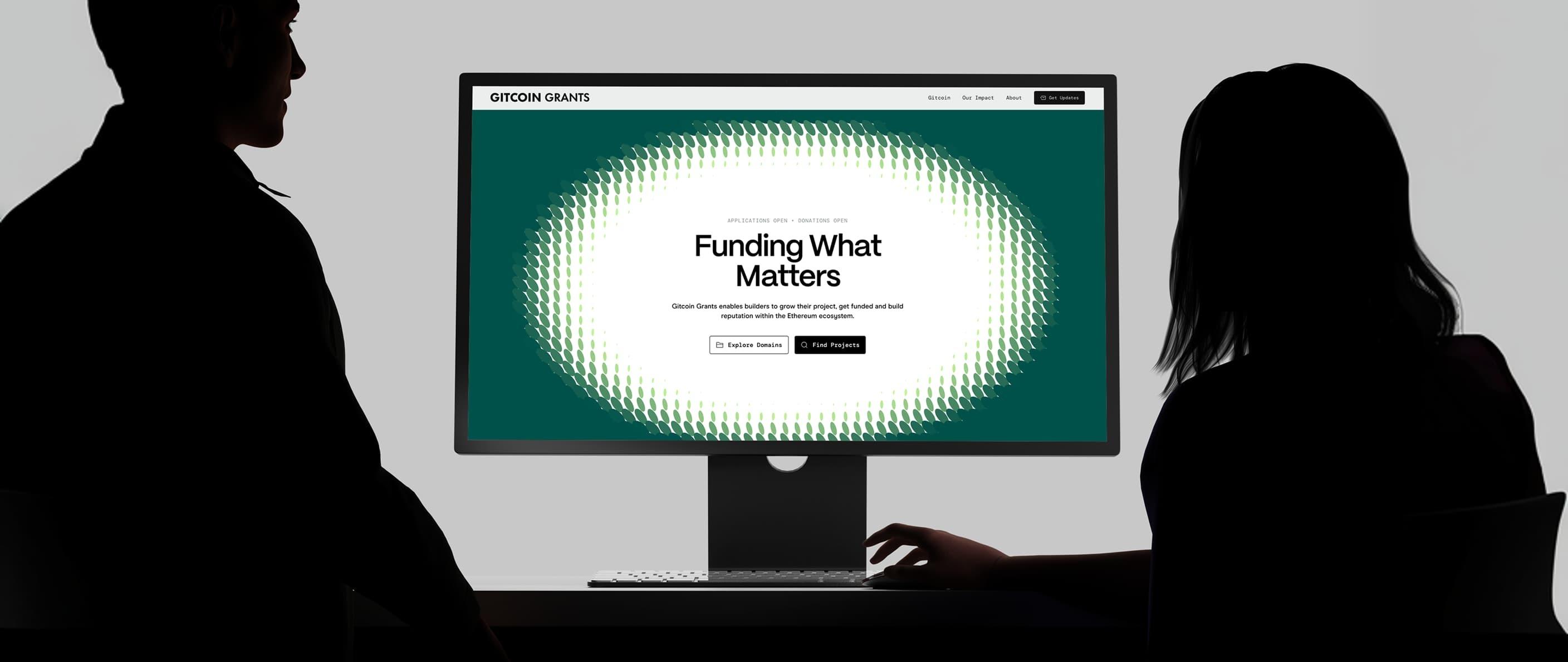
Gitcoin Grants
Design a flexible structure that could accommodate emerging grant categories in real time without sacrificing design integrity

L+R Brooklyn hosts open studio for NYCxDESIGN Design Week 2026
Gitcoin Rainbow Paper
Ground the brand in impact-focused thinking, moving beyond utility to influence the broader conversation surrounding decentralized funding and capital allocation


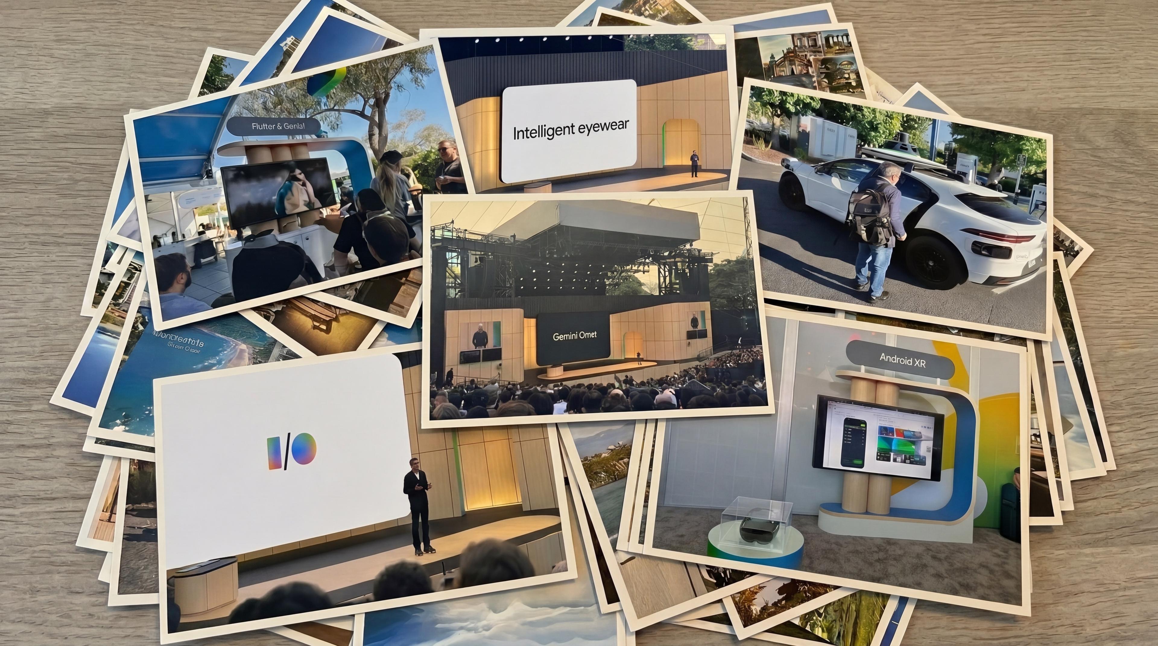
Postcards from Google I/O: What "AI" looks like when you stop talking about it