Change is in the air (literally). While space exploration has always been deeply woven into the American imagination, it’s never looked quite like this. Once locked behind thick steal government doors and available to only a few of America’s most elite scientists, space travel is not only cruising the free market, but also moving past the confines of a rocket ship aimed towards a solitary planet. To capture this cosmic shift, groups like Space Apps ramp up by hosting events like their annual conference and hackathon, to bring the community together and catalyze innovation. The mission is simple; improve life on Earth and further the exploration of space — but now, when the audience and message has expanded to the mainstream so dramatically, where does visual identity proceed? Space Apps NYC called on L+R’s strategy and aesthetics team to help them evolve the future of their celestial organization. We spoke to the L+R designer who led the design direction of the project. Chris Martinie talks about what goes into redesigning an industry as iconic as space.
Explain Space Apps and the project they approached L+R with.
Space Apps Challenge is a worldwide NASA innovation incubator program. They hold a global hackathon initiative to get young designers and engineers to be excited about space exploration and get their feet wet tackling new challenges for not only space flight, but also problems we see here on earth that technology could impact. Space Apps NYC was featured this year on the East Coast main stage. This means it was attended by top scientists, astronauts and sought-after experts in the field.
We wanted to bring the [Space Apps NYC] brand into the 21st century, make it more exciting and make sure it would reflect the excitement and new breadth and limitless opportunities of the space travel industry today.
What is the legacy of space design? How did space design develop?
When we [the human race] started to travel into space it was the 1960s and the style was steeped in 1950s futurism. That was how artists were dreaming of the future back then. Artists like Chesley Bonestell really created the look, and I think the design has been stuck there ever since. Even today, most of the branding and art and illustration for the space industry is centered around blue, black, swooshes…the same things you would see 60 years ago.
A few companies had a monopoly on all of space travel and they were all doing business with the government, primarily the United States government. Innovative graphic design was not a priority. Whenever we’re talking about a government institution usually their efforts aren’t focused on branding. Branding is a modern concept — the idea that the product, image, and experience of that company should matter.
When there are only two companies competing for a grant from the government, you’re more focused on the product, which of course is important, but there is only one user…the government. That’s not the case anymore. Now you have companies like SpaceX making space flight more commercialized and democratized. SpaceX clients consist of different governments, aeronautic organizations, and various companies so it’s becoming more of a commercial industry. They have a larger audience to appeal to so there brand’s identity becomes a lot more relevant.
What are key tenets that characterize the shift in past/present approaches?
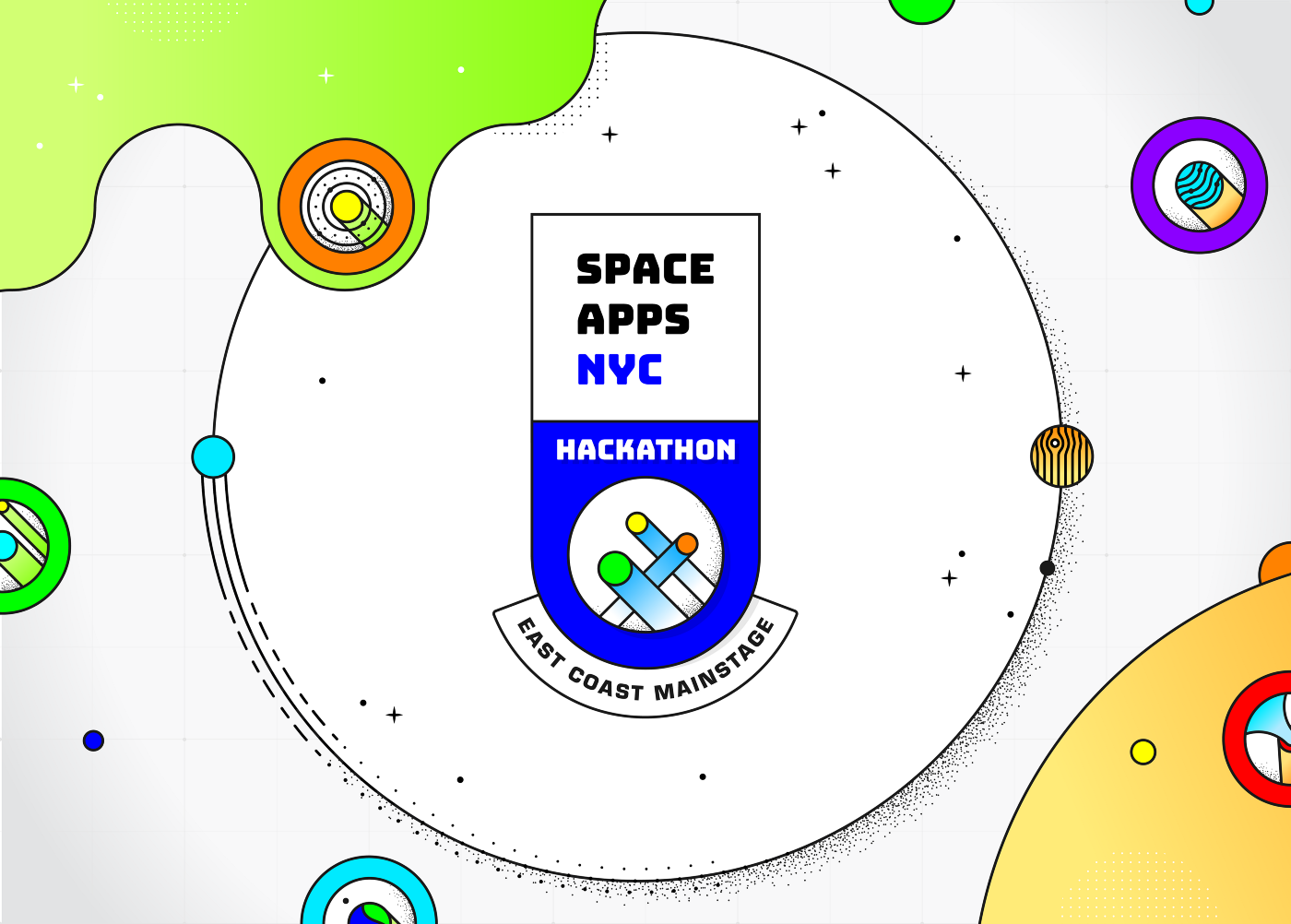
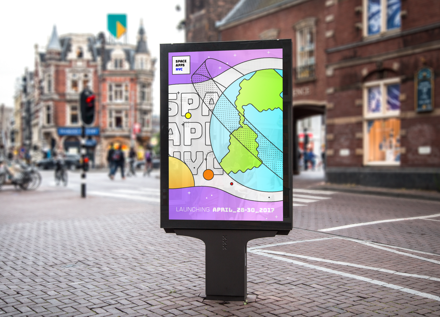
We ended up going with a very minimal approach because this isn’t necessarily for government or a big corporation we were able to take a lot more liberties with the fun nature of it. So there are a lot more RGB bright colors, bold lines, which were all inspired by the images of space I was looking at but also some of the old manuals from the NASA Graphics Standard manual. The manual was great inspiration for tying in this new energy with a deeper understanding of the legacy of the field. There is so much sentiment when it comes to old NASA, so we wanted to tell that story in a new way.
For the concept we decided on, we wanted it to show a modern understanding of science and the natural world, with a touch of artistry and abstraction — — whether it’s on a planetary scale (a solar system) or on a microscopic scale (within an atom), our natural world all ties together. So that was the spark for the idea for this branding. We wanted to make it a little more nuanced and representative of the complex understanding we’ve gained to date of the natural world, instead of the typical launch trajectory iconography.
The Space Apps event itself is about more than space travel. The theme of the event this year was about the earth and climate change. What’s great is that a lot of the technologies we use to solve problems on land have come from our endeavors to leave the planet.
What was most surprising challenge?
Overall we wanted to create a system that would last, that wouldn’t be just for this year — that they could use in the future. And it fits with the idea that space travel and space stations are already utilizing — it’s a very modular design so things can be detached and attached in different ways and that’s what will give it a lot of longevity in the future. You’ll be able to elaborate on it, add to it, change it, make it more simple or more complicated. I think that was the biggest challenge in the beginning: how can we make this a brand with longevity while also differentiating between the hackathon, the conference, Space Apps NYC, and the international Space Apps Challenge.
What was most exciting solution?
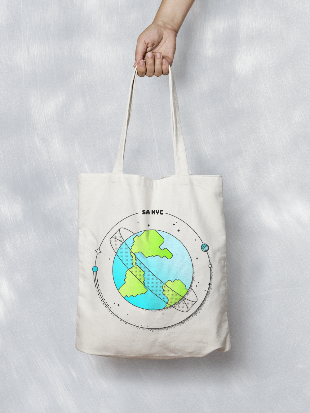
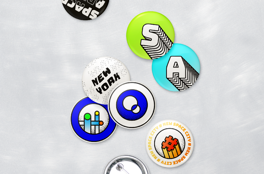
As we started to design all the different applications- the website, badges, marketing collateral, T-Shirts, tote bags, it was fun to see how it could unfold. At that point there was a general path with a few laws and guidelines, and the rest was supposed to be open ended exploration. Much like…space travel, eh? Mind blown. So it was just really fun- I was doing things that weren’t planned before but it fit within the system and surprised even me.
What made this project special to you?
My dad was a big history buff and in the air force, so I grew up around flight culture. I grew up wanting to be a pilot, going to flight camps, air shows, museums, you name it. That’s always been a dream of mine. I guess half of kids want to be an astronaut and I definitely was one of them. I have always wanted to do something with NASA, so this felt like it was the next best thing. It was really exciting. I always love getting into a field that hasn’t been touched that much, and I feel like this is an industry that across the board needs a big refresh, so that’s always exciting as a designer.
- - -
Alex Levin is a Founding Partner and Director of Strategy at L+R, a design research & development firm focused on user experience and creative technologies that bring the design process to businesses.
